Main Menu
Let's dive right in and check out how our main menu has changed.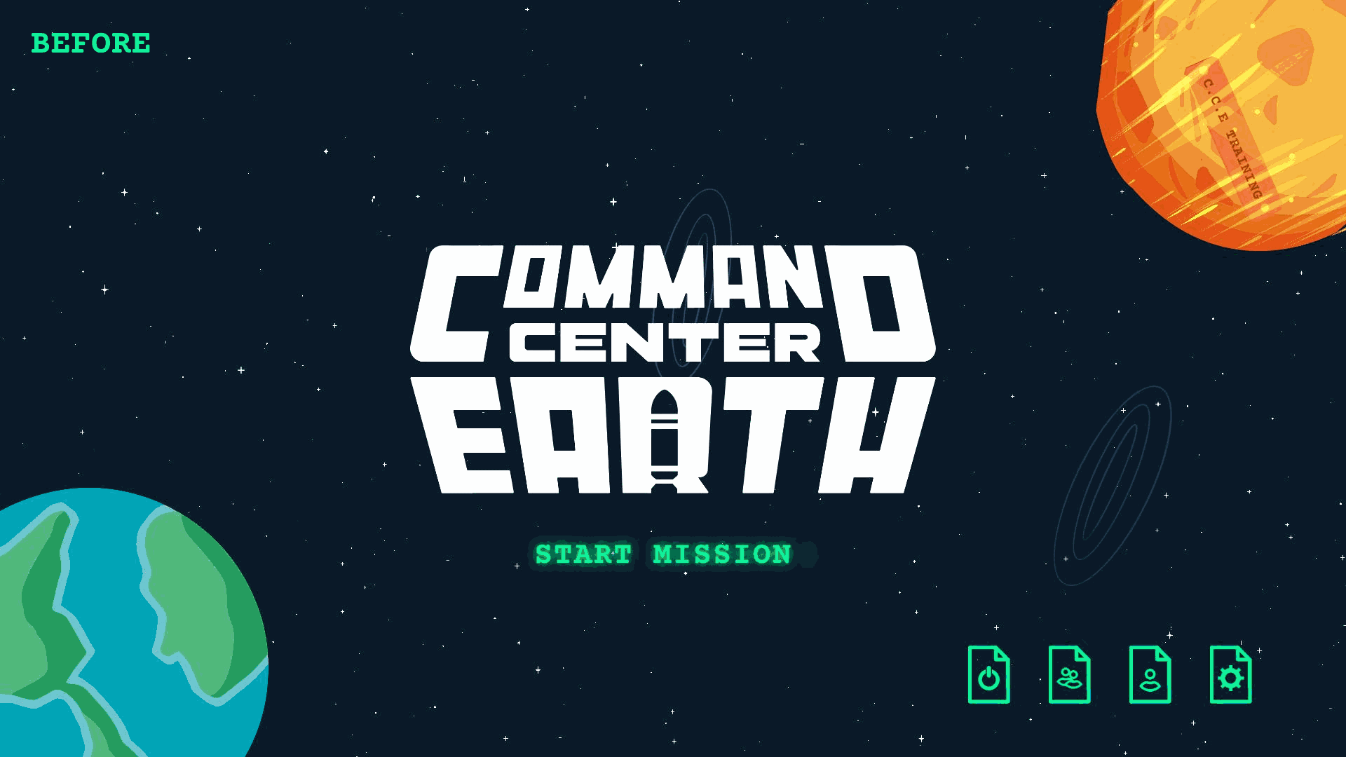
To start things off you can see that our start game button has been overhauled to make it more apparent when that button is selected. Additionally all of our icons in the game, including those found on the "File Buttons" have been overhauled to ensure they are more stylistically similar.
Button States
A major part of our UI overhaul involved creating a cohesive look for all buttons across various states. The goal was to ensure the button states worked for all our current input. Our main inputs targeted were Mouse + Keyboard, Controller, and Touch input! Let’s take a look at the 'File Button' as an example to show how each button behaves consistently in each state.
Hover

Selected

Selected Hover

Pressed

Settings Menu
The settings menu is a great example of both the icon and button state updates so let's have a look at the before and after to see how things changed!
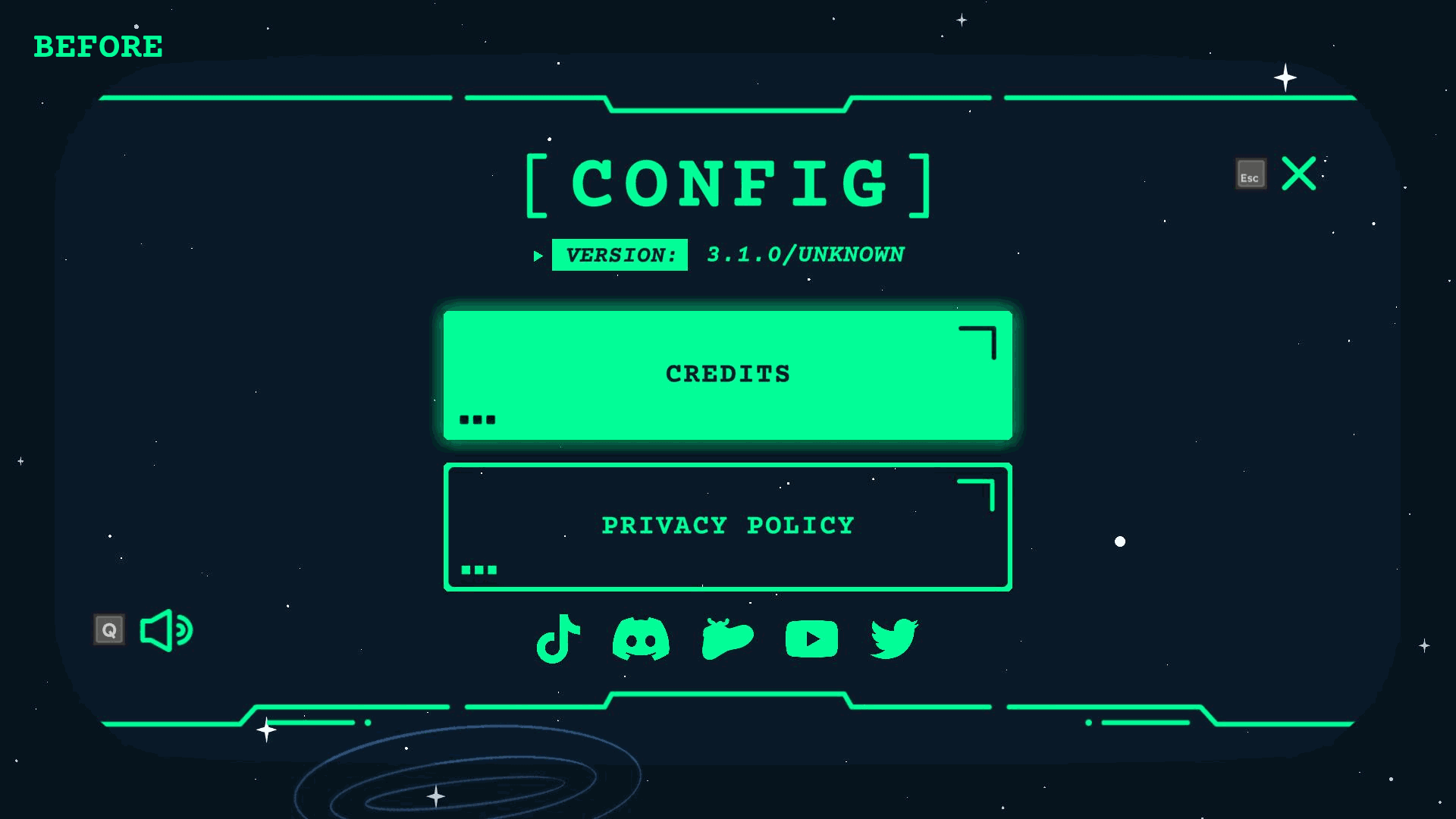
Immediately we can see that our social links have changed from a solid green to an outline. Under our new button state rules a button should only show (with few exceptions) as solid green if it is selected. This made the social buttons an easy target for some visual updates. As a result of the updates we can now more easily tell which button is currently selected on screen.
Additionally if we turn our attention to our audio (icon) button we can see that it's look has been refined and its stroke has been reduced to fall in line with the changes to all our icons.
Finally if we turn our attention to our credits button, we can see that the glow has been removed in accordance with our button state rules. This adjustment makes it clearer when a hover has occurred, distinguishing it from other states like selection, for a more intuitive user experience.
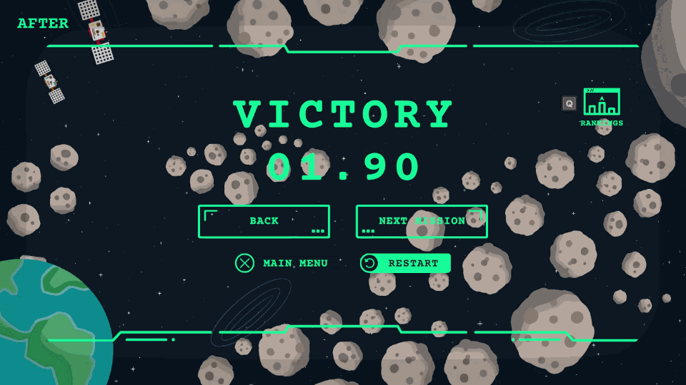
Secondary Button Bounce
Let's have a look at our previous "Post Level" menus to see a small but annoying issue that was occurring with our "Secondary Buttons". That is the "Main Menu" and "Restart" buttons show in the gif below.
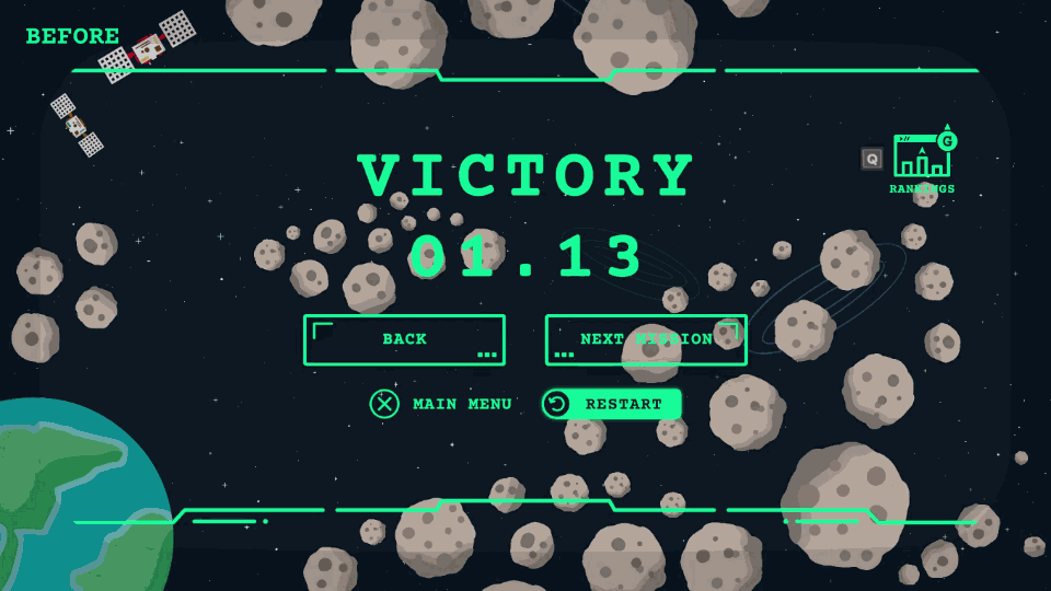
We can see from the gif above that when we change our selection to a "Secondary Button" a margin is added to the button creating a disorienting "bounce" effect.
Let's now take a look at our new "Post Level" menu to see how fixing this issue can lead to a more pleasant navigation experience.
Mobile & More
A major reason for the UI overhaul was to establish clear guidelines for updating and creating both current and future UIs across all targeted platforms. The goal of these guidelines is to streamline the process of delivering game updates with UI changes to players across all platforms. With these new guidelines in place, we’re aiming to deliver game updates to you faster across all targeted platforms!
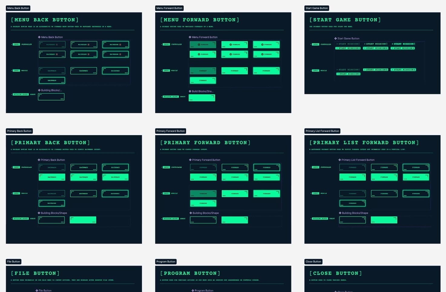
For all the UI/UX nerds out there, here's peek behind the scenes at CCE's design library.
Bug Fixes
There was bug flying under the radar that was causing friend leaderboards to fail to load. This bug was only manifesting when a player had fellow Steam friends who had purchased CCE. This bug has been fixed, so friend leaderboards should now load displaying any Steam friends who have purchased the game!
Conclusion
We would love to hear your thoughts on the new update so please feel free to reach out via our Discord, or by leaving a comment below! Additionally if you've purchased CCE and are enjoying it, don't forget that one of the best ways to show your support is to leave us a review :).
Changed files in this update