This marks the end of months of production, and our very first game release as students. We have learned many things along the way, faced many hardships, but we are so incredibly proud to finally bring you this horror sci-fi experience.
We hope you enjoy the game!
We also wanted to share some never-seen before concept art, which helped us shape our game into what it is today.
Happy launch day, and from everyone at the Anabasis & Co. team, welcome aboard!

Originally, we had four crew members aboard our ship. However, judging with our resources and the time we had to create this project, we had to make the decision to only keep the characters that were already modeled. It was a hard decision to make, but we learned how to better understand our scope.
Concept by Sidney Torck
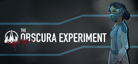
Concept for our generators. We decided to go with the rounder model, as it felt more dynamic and offered a different silhouette than a lot of our other assets.
Concept by Elsie Yip
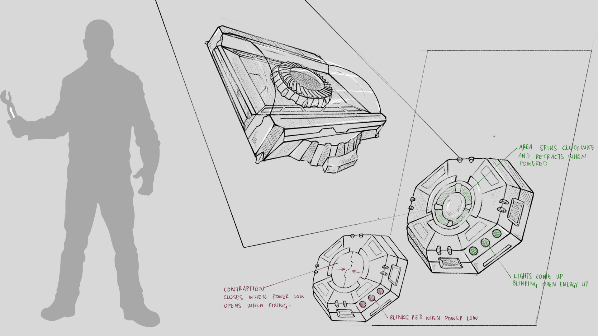
Originally, the player also had to manage their oxygen levels on the ship. Our characters had oxygen masks and a backpack that served as an oxygen tank, and there were oxygen stations to replenish the tanks, as you can see in the bottom left. Throughout the production of our game, the mechanics changed a lot, and while we no longer have to manage oxygen, we still kept the assets that were already modeled. Since the masks were there from the beginning, we hadn’t planned to animate our characters talking, so we kept the masks to avoid making the animations for it as well as to remind the player of the fact that we are on a failing spaceship. The oxygen station has also been converted into the energy stations you see onboard to refill your tablet.
Concept by Elsie Yip
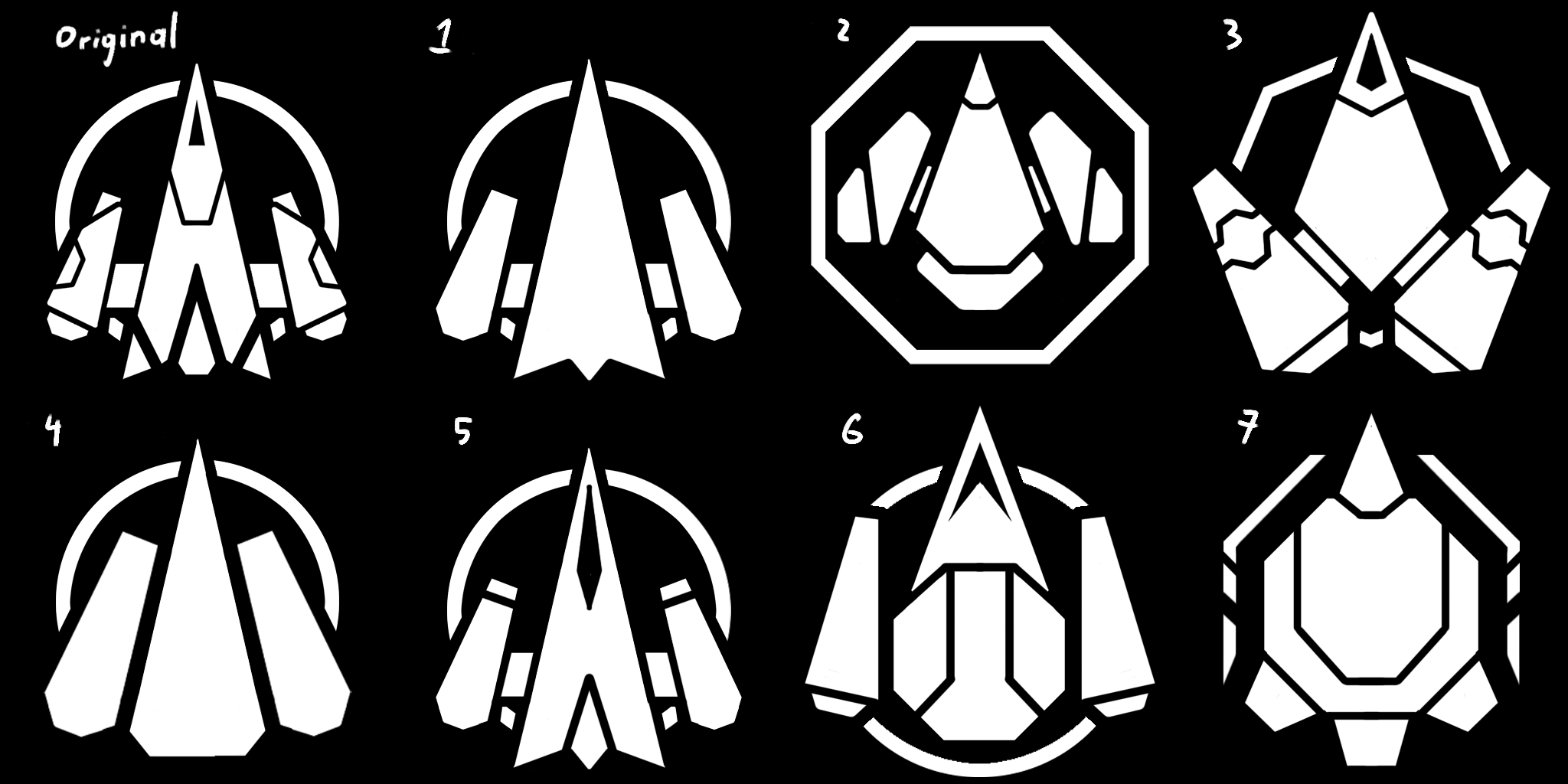
We explored a lot of different shapes to find the perfect base for our logo. We had a few different goals: make sure the logo had both sci-fi and horror elements, was simple enough to make it easy to read even when small, and could be used throughout our ship as branding for the expedition.
We landed on the 5th logo, as we felt it was the one that was meeting most of our goals, however we still needed the horror element. Which is why our logo is now all bloody! That was when we decided that the clean logo was the logo of Anabasis & co., and the bloody one is the logo of our game.
Concept by Sidney Torck
As a bonus, here is a higher quality image of the concept that was used in our last announcement!
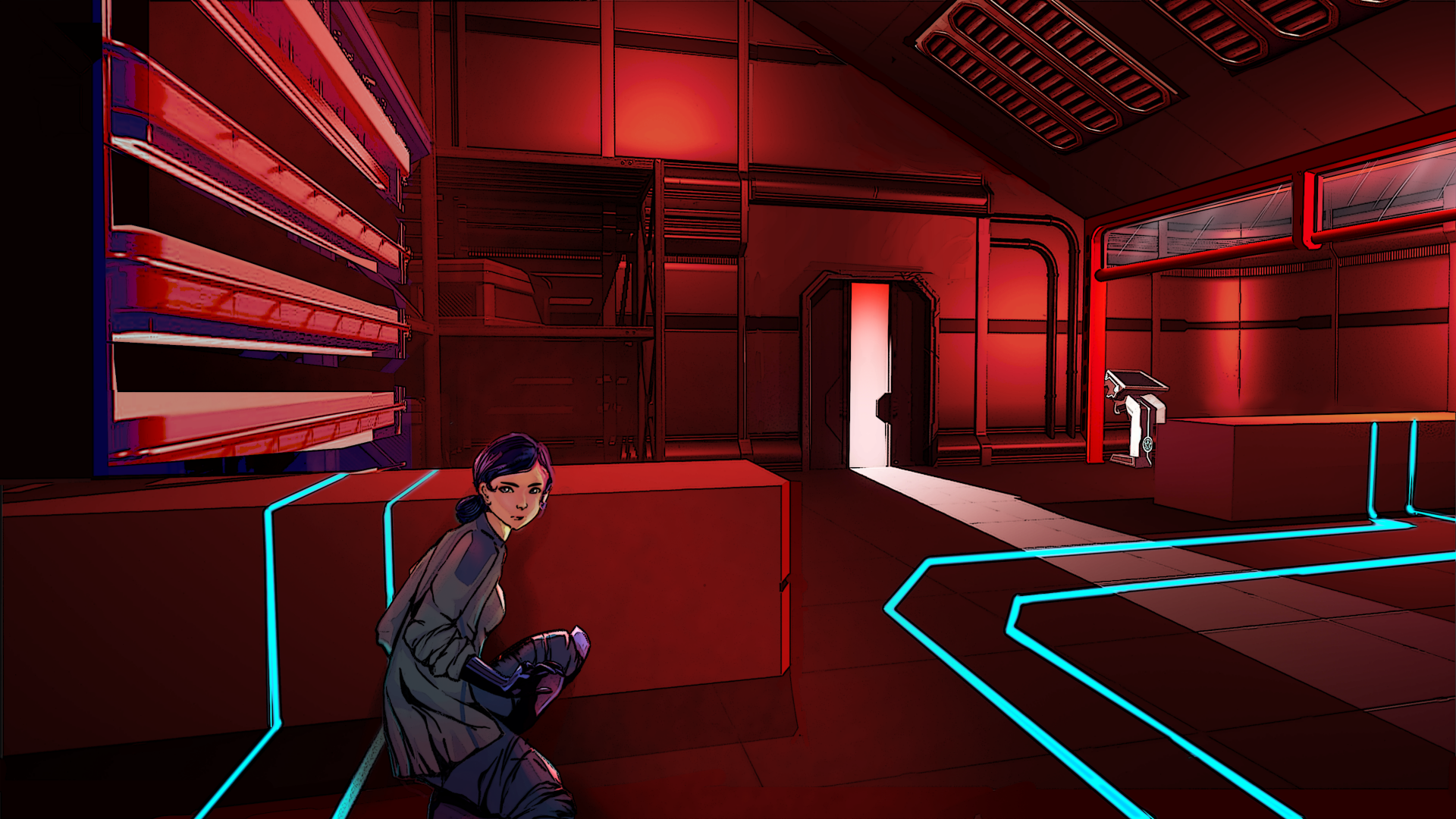
Earlier in the production, most of our lighting was in shades of red, which made it quite hard to distinguish rooms from one another. In the end, we decided to have much more variety in our lighting.
Concept by Elsie Yip