
To follow on from Build 11, this build has continued reworking the UI by overhauling the look of the in-game HUD. This has involved completely redesigning the positioning and look of the in-game HUD from the elements in the top/left and top right to all be together in a single decorated bar at the bottom.
The aim was to bring things together in a more cohesive single arrangement.
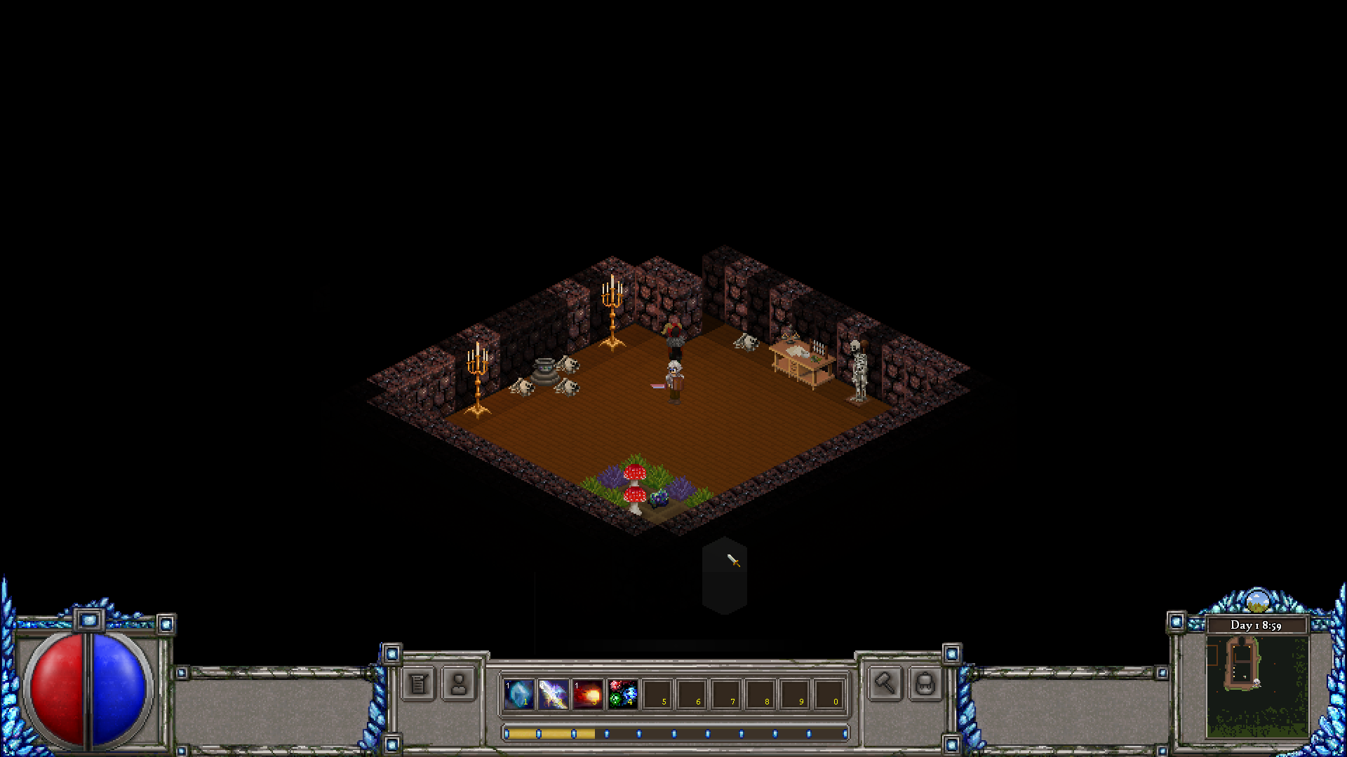
Below shows the HUD section across the bottom:
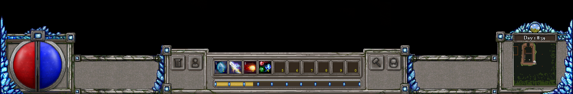
Looking at the Bottom Left:
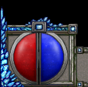
- The health and mana bars are now in the bottom left.
- The experience bar has now shifted centrally and under the action bar.
- Certain things have been cleaned or omitted in the redesigning - such as the Character Profile/Name and Extra Strikes.
Bottom Middle:
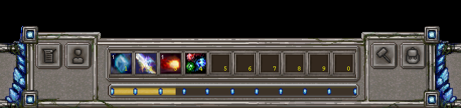
- The action bar still remains in the same position.
- Other key option buttons are now worked to sit around the action bar frame.
- Experience bar now sits below.
Bottom Right:
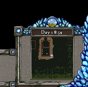
- The Map, Day & Time information has moved to the bottom right.
- Certain things have been cleaned or omitted in the redesigning - such as the Building Edit indicator and NPC conversation indicators.
And below is a full screenshot, showing the HUD as it fits altogether:
Cheers!
Phill
Changed files in this update